


Rebuilding the digital presence of Texas’ IT backbone.
User Research, Information Architecture, Drupal CMS, Brand Design, Visual Design, Responsive Design System, Messaging, Content Migration
DIR manages all comms tech, government information and related operations for the state of Texas. Through its website they connect state agencies to the best IT vendors in the country. Its infrastructure is responsible for securing the state’s data and they’re charged—by law—with driving economic competitiveness for Texas.
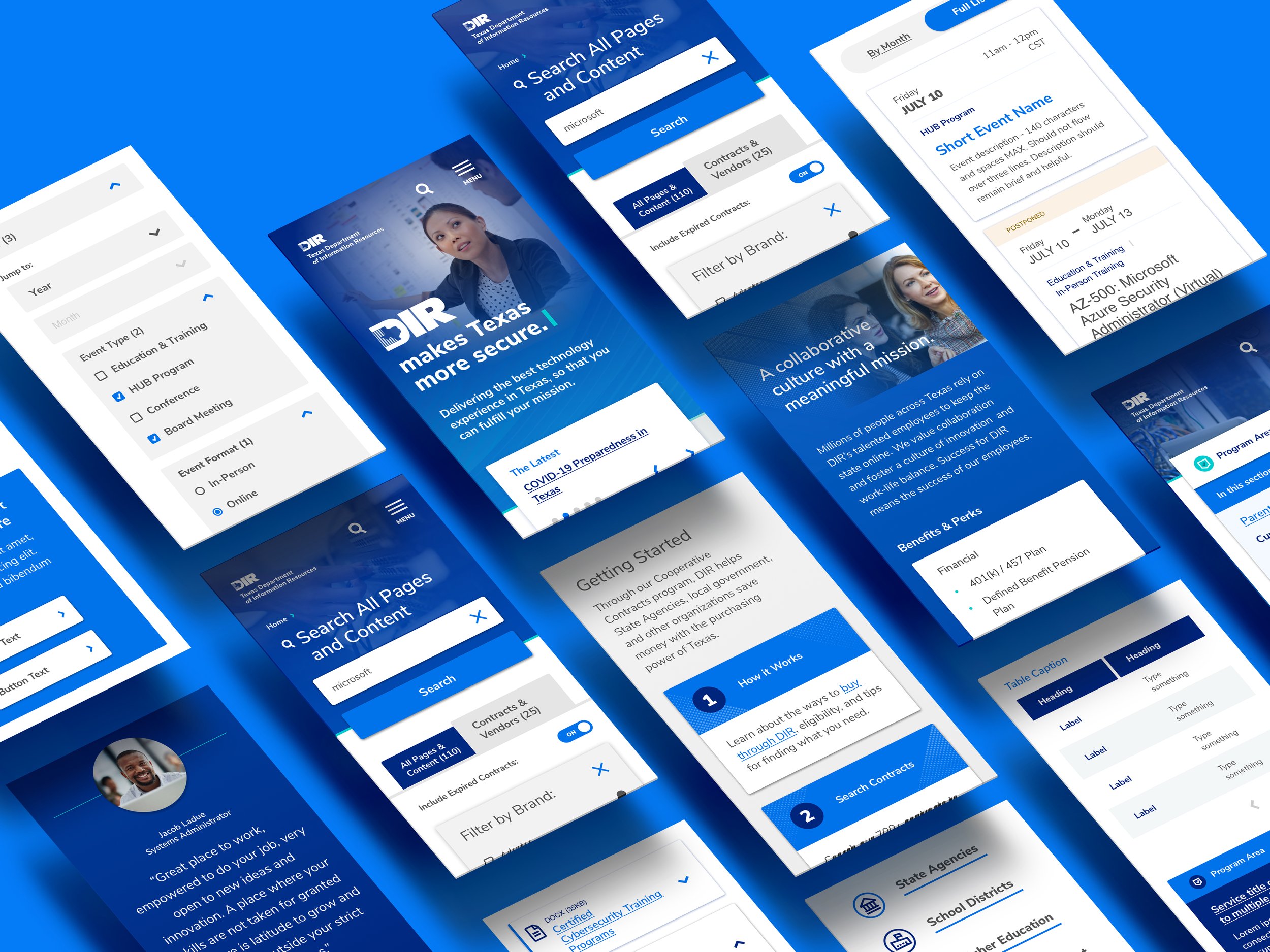
Years of feature creep had taken its toll. The sitemap was unmanageable, services unfindable, responsive support nonexistent. Audience goals had blurred and customer calls were piling up. It was time to migrate 100K+ pages of content into an intuitive architecture and dynamic CMS.
Research time. Through audits, surveys, interviews, and workshops, we identified user and organizational need. By assessing DIR’s capacity to manage change, we drafted a design strategy with realistic short- and long-term goals.
Before touching site architecture, we plotted every user need and desired outcome. Persona research informed our taxonomies. Detailed journeys revealed the required functionality the site would support.
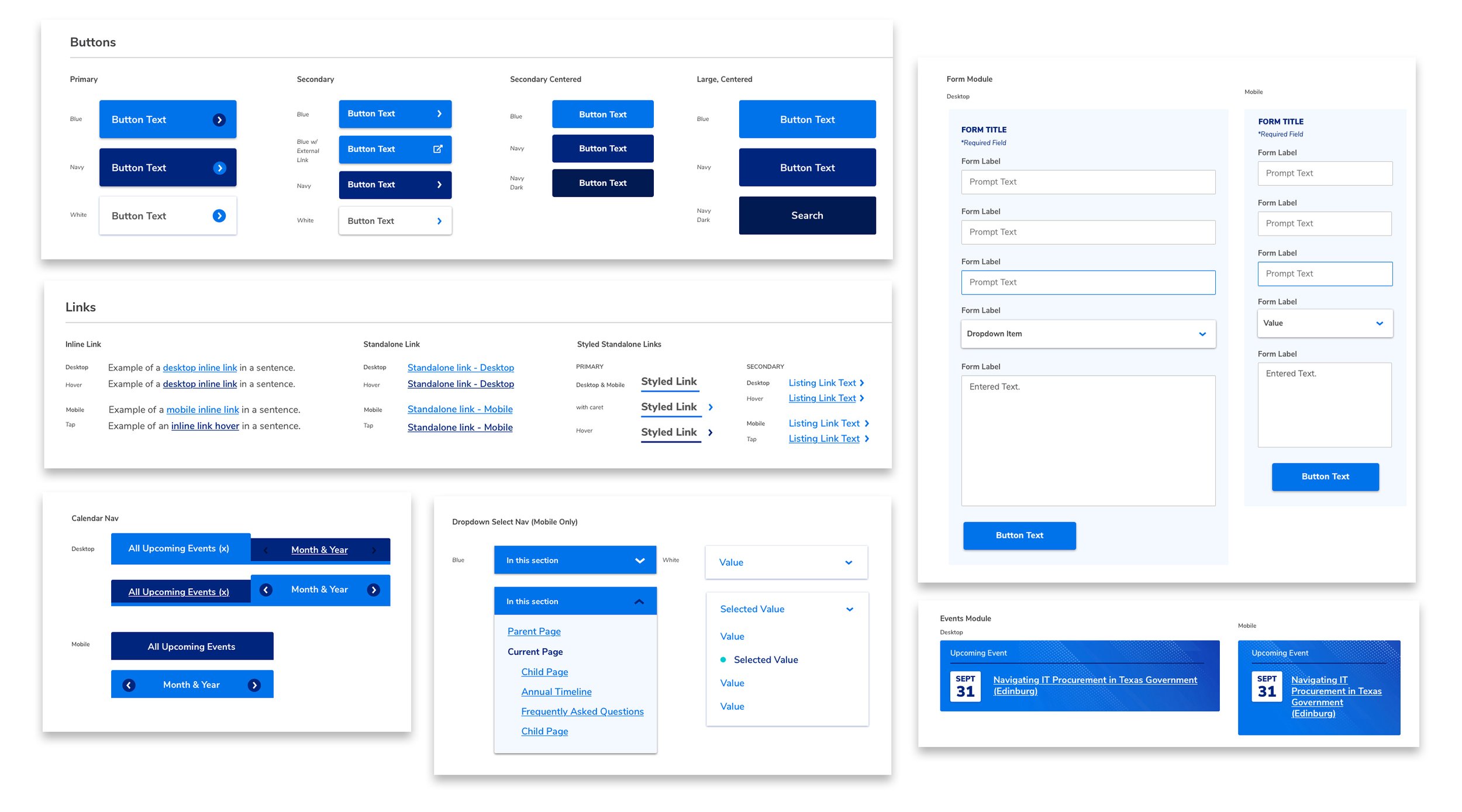
New content architecture meant new content types (structured and unstructured). That meant new design patterns requiring a balance between budget, ease of migration, engineering complexity, and usability.
Organization and clear design ops. Communication is constant. Design components share class names. Libraries are linked between visual design and handoff (Figma > Zeplin). Version control and documentation are cloud-based for easy access, and QA is agile, embracing a kanban-style PM process.
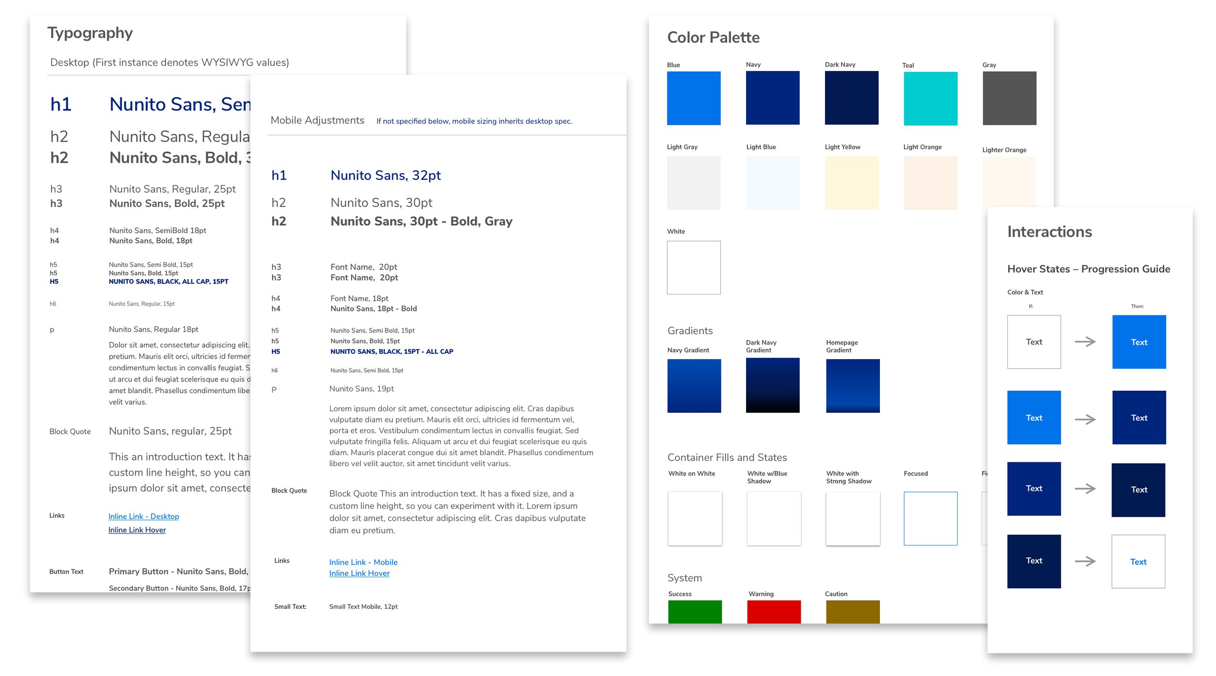
Now, visual design supports UX and organizational identity. A thorough component-based system deploys clear, simple interfaces for intuitive, task-heavy usage.
New typography, color palette and image art direction carry over to offline marketing and collateral, rounding out a brand transformation anchored in a digital-first mindset.
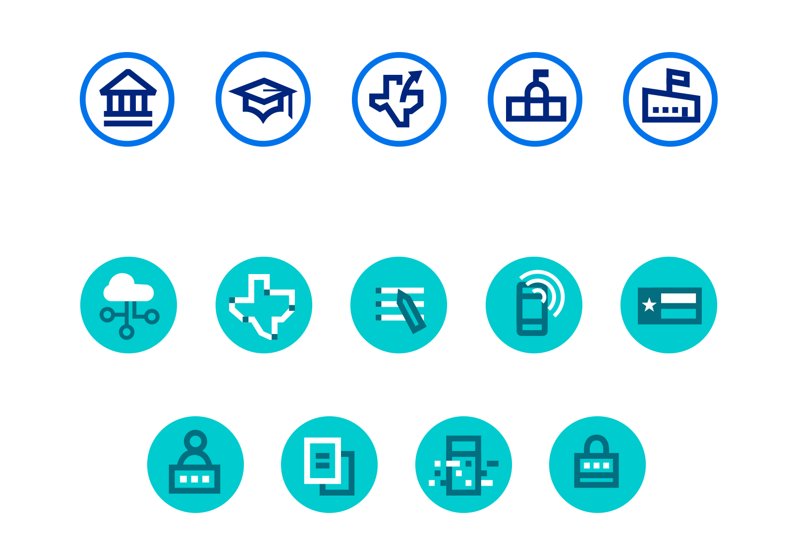
Being fully WCAG AA accessible, flashy animation and transitions were off-limits. Instead, we added a small set of custom icons to add subtle character to intentionally stark branding.